

Since 2025
An admission form patients actually complete, from home
Eight steps, eighty-one fields, identity documents to photograph — completed by patients who are often elderly, or by a relative on their behalf. Here accessibility and clarity are not optional: they decide whether the file ever arrives.
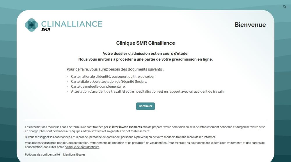
on the automated accessibility check of the public page (axe-core): a single violation, one contrast
pre-admission files completed online by patients or their relatives
accounts to create: the patient enters through a link that opens only their own file
The context
Before a hospital stay, the clinic needs a complete file: identity, social security, insurance, next of kin, GP, supporting documents. Collected by phone or on paper, that file ties up the front office for days and still arrives incomplete. Put online, it simply moves the problem: the person filling it in is often seventy, doing it on a phone, and sometimes it is their son doing it for them. One badly labelled field, one error signalled by a red outline alone, a form that cannot be resumed tomorrow — and the file never arrives.
The workflow, in motion
What happens when a field is missing
The form is filled in by patients and their relatives, often elderly, from home. Accessibility is not proven by a chain of steps: it is proven the moment something is missing.
linkA single-use link opens the file: no account to create, no password to remember.
- check_circlePatient identity
- check_circleRequested admission date
- check_circleGeneral practitioner
- check_circleEmergency contact
campaignrole="alert"
Field completed. The fix is announced too: otherwise the person who never saw the error has no way to know it is gone.
Submit the file
The file goes to the care home, and the relative who filled it in can come back to it through the same link.
The public page scores 96 / 100 on the automated accessibility check, and the live regions are in the code — verifiable, not declarative.
What we did
- check_circleEvery field carries a label genuinely tied to it, not just grey text above. That is the difference between a form a screen reader reads out and one it walks through saying “edit box”.
- check_circleErrors are announced, not merely coloured: a live region says how many fields are missing, and the cursor lands on the first one. The move is announced too — without that, it feels arbitrary to anyone not looking at the screen.
- check_circleThe file is resumed through a single-use link, with no account or password to remember. A truncated or wrong link opens nothing at all, rather than opening an empty file that would overwrite the real one.
- check_circleEach step is saved on leaving it. Someone who breaks off to fetch their insurance card finds everything waiting — the leading cause of abandonment on a long form.
- check_circleTwo steps were REMOVED at the clinic's request, because they were handled elsewhere. A health form is judged by what it does not ask: every field removed is one fewer abandonment and one fewer piece of personal data to protect.
- check_circleThe data-processing notice sits on the page, in plain words, with the patient's rights and a link to the privacy policy — not in a footer link nobody opens.
What changed
- trending_upThe file arrives complete before admission, without the phone back-and-forth that used to occupy the front office.
- trending_upA relative can fill it in for the patient, and the form knows it: it then asks who they are, instead of pretending the patient is the one writing.
- trending_upThe form stays usable by keyboard and screen reader. It is not a declared conformity: it is written into the code, and the decisions are commented so the next change does not undo them.
- trending_upThis is a health-data form: nothing is collected that admission does not need, and retention is decided with the processing register, not at random.
The services involved
This engagement drew on the following expertise. Each has its own page, with its method and its deliverables.
Other case studies
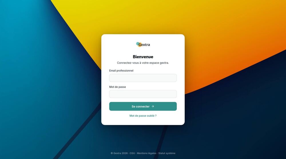
Gextra
Since 2010Patient referrals, care records, team scheduling, recruitment, billing, mobile apps: a complete business system, sixteen years of rules, thirty sites — and an interface being rebuilt screen by screen without ever stopping the work.
Read the case studyarrow_forward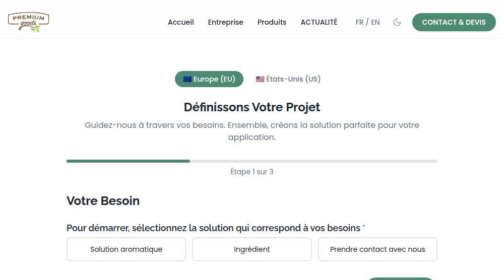
Premium Goods — site public
Since 2018Vanilla, flavours, tobacco: the same product is not named the same way in Europe and in the United States. The public site handles that, from the copy through to the form.
Read the case studyarrow_forward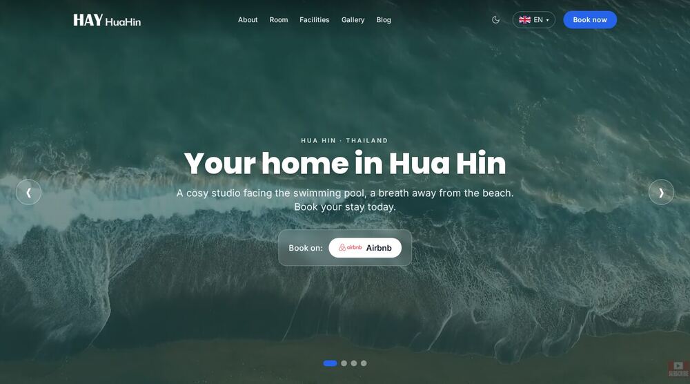
HAY HuaHin
Since 2024A studio rental in Hua Hin, Thailand. Site rebuilt, hosted, deployed and optimised by us — and it is our own money going into the Google Ads campaigns.
Read the case studyarrow_forwardLet's talk about your project
Thirty minutes is enough to tell whether we are the right fit. We reply within 48 hours, and we say no when it is not for us.